There is 'almost' never a good reason to use pie charts
Five reasons the pie chart is the wrong default, and the one case where it earns its place.
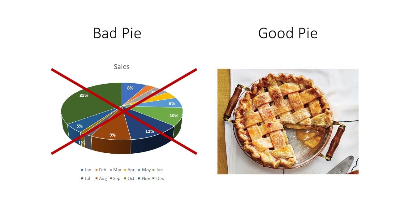
It is quite mind-boggling how many people tend to prefer a pie chart for data visualization. Some reasons why it is not a good idea:
1. It does not allow for easy comparison of data
The only worse design than a pie chart is several of them, for then the viewer is asked to compare quantities located in spatial disarray both within and between pies.
— Edward Tufte, The Visual Display of Quantitative Information
2. It forces us to make angle judgments, which we are bad at
Pie charts encode quantitative values primarily by two means: two-dimensional areas of the slices and the angles formed by the slices as they radiate out from the center of the pie. We now know that neither of these visual attributes is easy to compare. Our eyes are great at comparing differences in 2-D location and differences in line length, but not 2-D areas and angles.
— Stephen Few, Perceptual Edge
3. It is simply not efficient
It takes more space to represent the same data as a bar chart.
4. Accurate values are hard to read
There is no scale.
5. It causes confusion and leads to misinterpretation
It can be used to deceive you. Particularly, be suspicious of those who use 3D pie charts a lot — in 2008, Apple used a pie chart to show their market share to their shareholders.
The one use case a pie chart does have is when you want to show a 'part to whole' relationship in an obvious, quick way. Especially to show fractions such as a quarter, half, three-quarters; but even here, if you are not careful to show the slices in a way we can easily comprehend the values (i.e. at right angles), you confuse the reader. If you care about your audience, try to minimize the use of pie charts.
For further reading, "Save the pies for dessert" is a great explanation by Stephen Few for why pie charts are a poor choice for visualizing and analyzing your data.